I once watched a senior designer build an entire enterprise color palette in under four minutes without ever looking at a mood board, a design inspiration website, or a color wheel. He didn't agonize over whether the blue felt "innovative" or if the green felt "organic." He just opened a raw CSS file, typed out ten highly specific hex codes, ran an automated accessibility linter on them, and deployed the changes. It was the most brutally efficient workflow I had ever seen.
Junior designers pick colors based on emotion and aesthetics. Professional web designers choose color palettes based on rigid mathematical constraints, semantic requirements, and aggressive accessibility laws. If you are picking colors because they "look nice together," you are doing it wrong.
The semantic anchor points
The dumb solution that works is completely ignoring the brand color until the very end of the process. You must build your semantic anchor points first. Every single web application on earth requires four specific semantic colors: Error (Red), Success (Green), Warning (Yellow/Orange), and Information (Blue).
You cannot change these. If you try to make your error states purple because it matches your brand guidelines, your users will actively fail to complete their forms because they won't recognize the validation warnings. When I start a new project, I lock in #EF4444 (Red) and #10B981 (Green) before I write a single line of layout code. These colors are non-negotiable. They are the structural beams of the application.
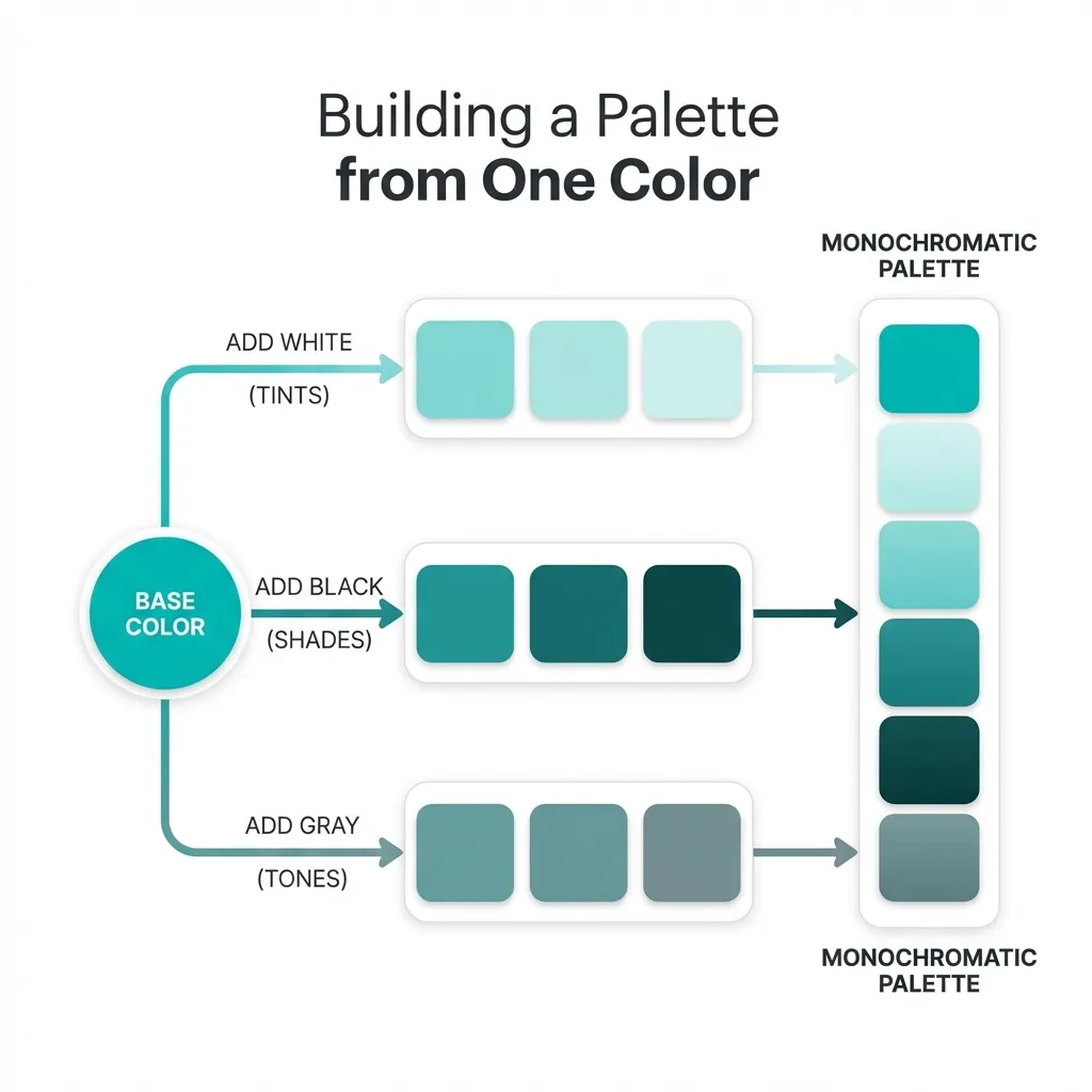
Generating the neutral scale
The second step is generating a massive, highly specific grayscale. Your application will use grays for absolutely everything: backgrounds, borders, secondary text, disabled buttons, and shadow overlays.
I think the biggest amateur mistake is using a pure mathematical gray (where the RGB values are identical, like #808080). Pure grays look incredibly cheap and sterile. Professional designers actively tint their grays with a tiny fraction of their primary brand hue. If the client's brand is a deep navy, the designer will generate a 10-step lightness scale where every single gray has a 3% blue saturation. It subconsciously ties the entire application together without the user ever explicitly noticing.
(I actually keep a dedicated snippet file containing the exact, tinted neutral scales used by Stripe and GitHub just so I can copy-paste them into new projects without having to manually calculate the HSL offsets every time.)
The contrast math check
Once the semantic colors and the neutral scale are locked, you finally introduce the primary brand color. This is usually the color of your primary action buttons.
This is where the entire process usually falls apart. If the marketing team hands you a vibrant yellow logo (#FBBF24) and demands it be the primary button, you have a massive problem. Yellow buttons with white text fail WCAG 2.1 contrast guidelines violently. Yellow buttons with black text look like construction zone warnings.
There's no clean solution to a toxic brand color; the mandatory workaround is creating an "accessibility-safe" digital variant. You take the marketing team's yellow, and you deliberately drop the lightness in the HSL color space by 15%. You use this darker, readable variant exclusively for text and buttons. If the marketing team complains that it doesn't match the business cards perfectly, you explain that failing digital accessibility audits is a legal liability. You cannot compromise on contrast math.
Stop browsing Pinterest for color palettes. Pick your four semantic colors. Tint your neutral grays. Enforce a strict 4.5:1 contrast ratio for all typography. The palette will practically build itself, and it will be completely bulletproof in production.