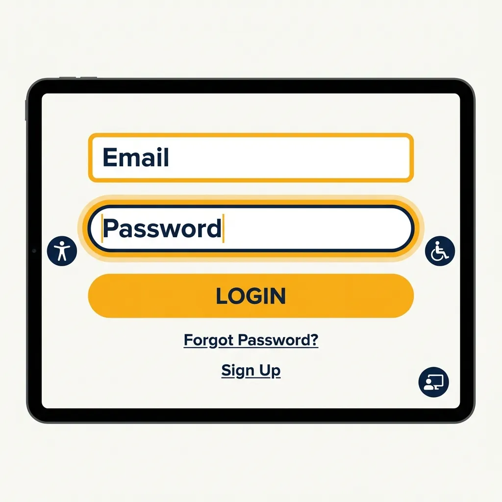
I proudly shipped an incredibly beautiful, minimalist light-gray form UI for a massive e-commerce client last year. The marketing team loved it. The CEO thought it looked like an Apple product. Then, their older customers started calling customer support in droves because they literally, physically could not see the input fields on their older monitors.
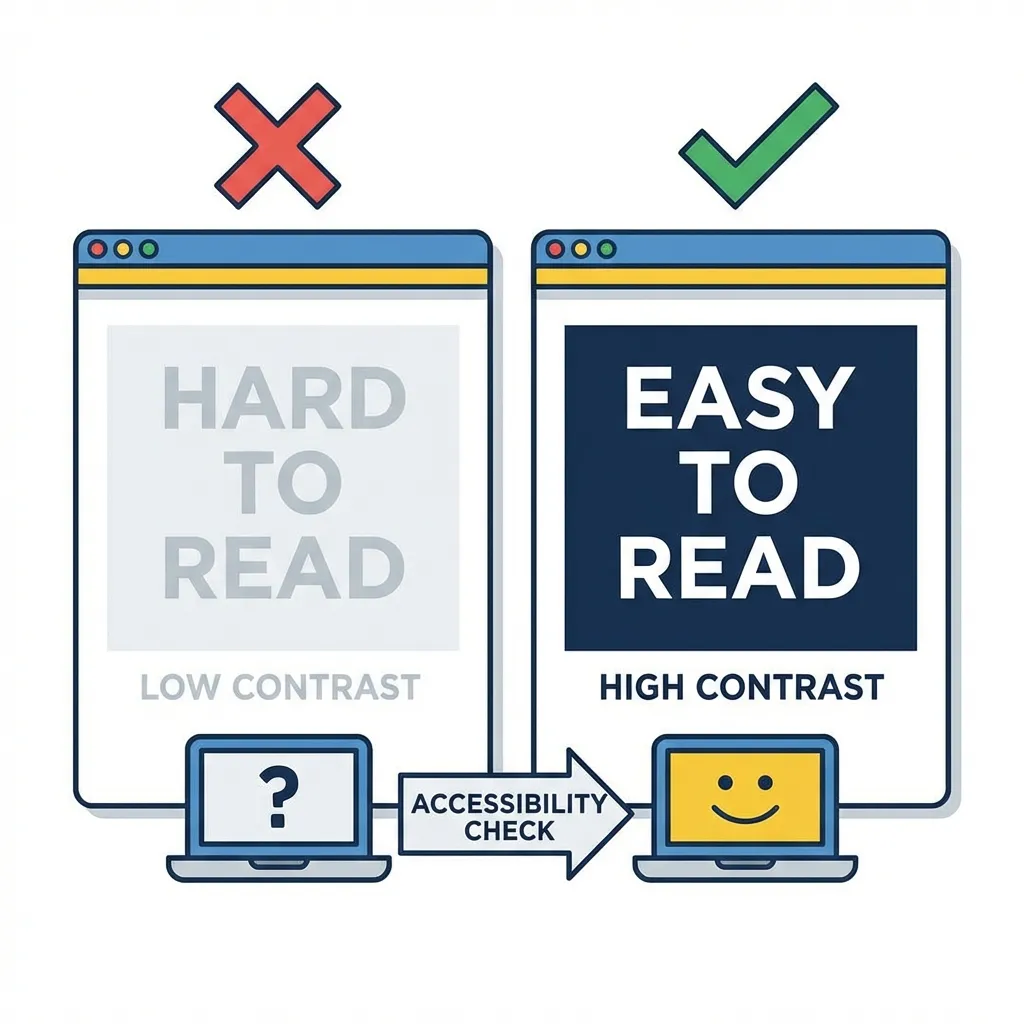
I had completely failed the WCAG 2.1 contrast guidelines because I trusted my expensive monitor instead of the math. Contrast isn't a mere design suggestion or a nice-to-have feature. It is a strict, unyielding mathematical requirement for digital accessibility, and in many countries, failing it is actually illegal.
The non-negotiable magic numbers
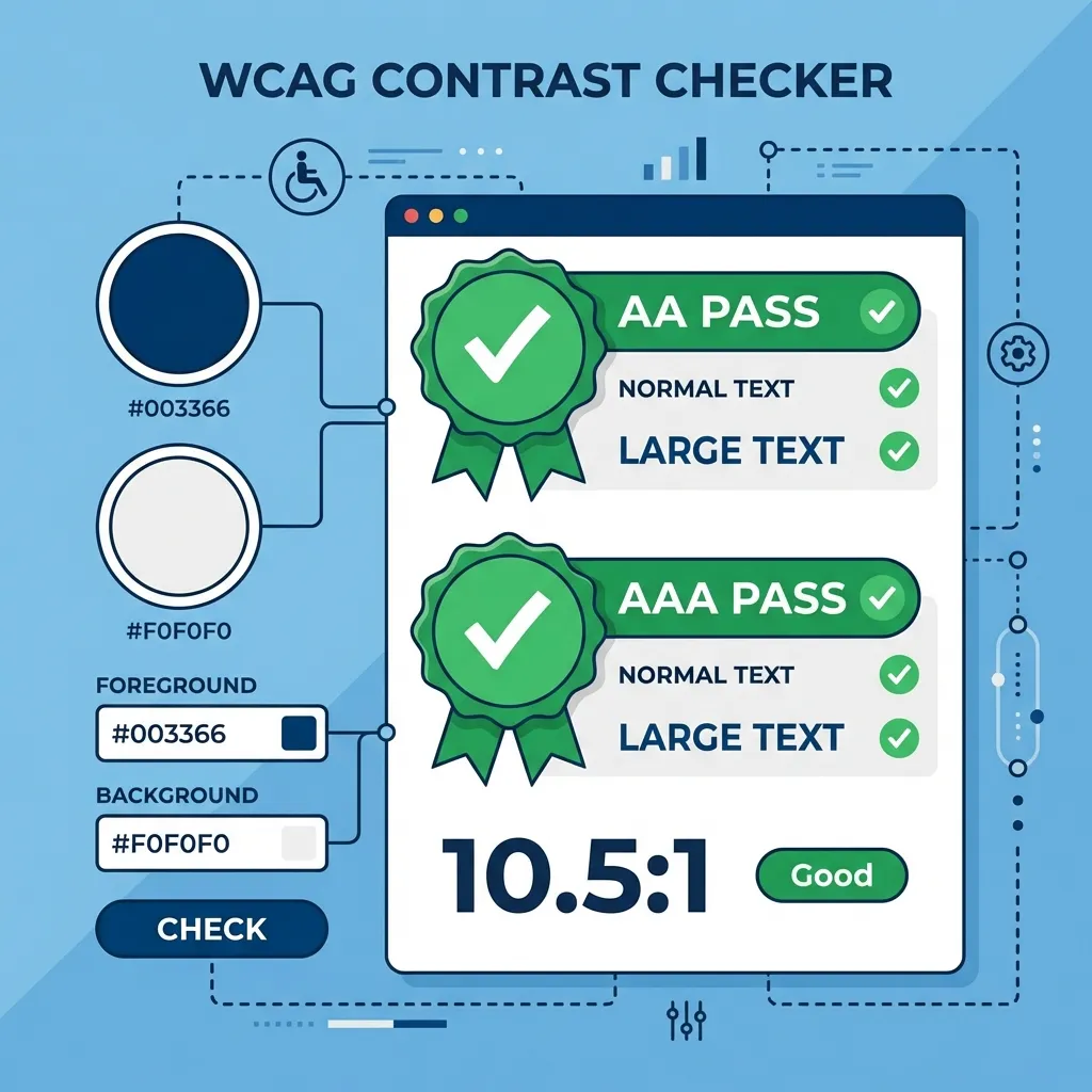
You need to permanently memorize exactly two mathematical ratios: 4.5:1 and 3:1. Normal body text requires a strict 4.5:1 contrast ratio against its background to be considered legally accessible (WCAG AA). Large text (defined as over 18pt regular, or 14pt bold) requires a slightly more forgiving 3:1 ratio.
The dumb solution that works flawlessly is aggressively ignoring your own eyes entirely. Your $2,000 Apple Retina display is actively deceiving you. It has incredible, industry-leading contrast ratios that your users' cheap, five-year-old 1080p office monitors absolutely do not possess. If you guess whether a gray text on a white background is readable, you will fail. You must run every single hex code combination through a mathematical contrast checker before it ever hits a production stylesheet.
(I actually keep a dedicated spreadsheet of "accessibility-safe" variants of common, popular brand colors just to aggressively avoid these exact arguments during the developer handoff phase.)
Fixing the toxic brand color problem
There's no clean solution when a client's official, legally trademarked brand color violently fails a contrast check on a standard white background; the mandatory workaround is usually a very difficult, uncomfortable conversation with their marketing department.
If a client hands you a light, vibrant orange (#F97316) and explicitly demands that you make it the primary interactive button text, it will mathematically fail. It is unreadable. I think the absolute best approach in this scenario is to drop the lightness of that specific orange in the HSL color space by exactly 15% specifically for digital text applications. You create a "digital typography" variant of the brand color. The brand team rarely notices the slight darkening on a screen, but visually impaired users will absolutely notice if they can't read the critical checkout text.
Automating accessibility in your pipeline
Do not rely on humans to remember to check contrast ratios. Humans are lazy and forgetful. If you are using a modern build system, you must automate this process.
I configure strict accessibility linters (like axe-core) directly in my CI/CD pipeline. If a junior developer pushes a pull request that pairs a light gray text (#9CA3AF) with a white background, the automated pipeline physically fails the build and refuses to deploy the code until the contrast math is fixed. It entirely removes the emotional debate from the design process.
Do not trust your monitor. Do not trust the brand guide. Trust the math. If a color combination fails the 4.5:1 ratio, it is fundamentally broken. Change the color.