A corporate client once handed me a single neon green logo (specifically #10B981) and confidently told me to "build their entire SaaS platform around it." If I had just plastered that aggressive green across every header, button, and active state on the screen, the application would have looked like a toxic waste spill. I had to build an entire, mature design system using literally nothing but that single hex code.
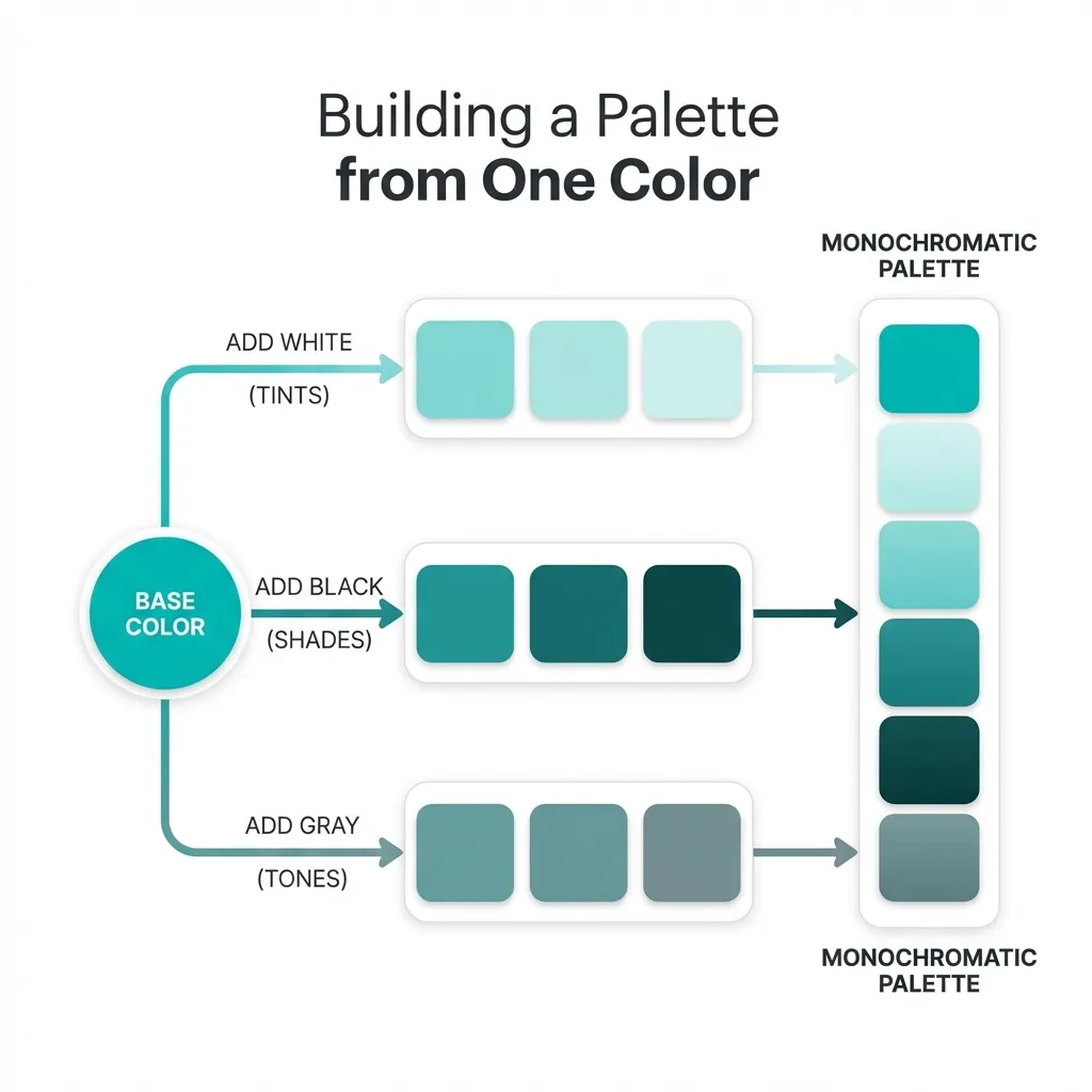
You truly only need one primary hex code to build a complete, professional user interface. The entire trick is mathematically extracting a cohesive, 10-step scale from it without ever touching a manual color picker tool. If you try to eyeball a palette from one color, you will fail. If you use math, you cannot fail.
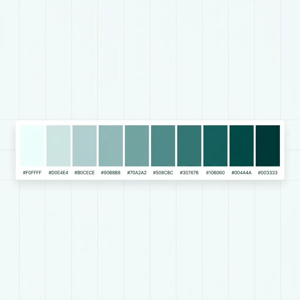
Extracting the cohesive neutrals
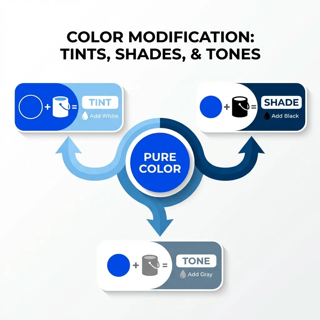
The single most catastrophic mistake junior developers make when building a palette is grabbing their vibrant brand color and then randomly pairing it with a pure, mathematical gray (like #808080). That is a fundamental error in color theory. Pure gray next to a highly saturated brand color looks completely dead. It creates visual dissonance because the gray feels entirely disconnected from the brand.
You have to actively tint all of your neutral backgrounds and borders with your primary hue. The dumb solution that works every single time is taking your primary brand color, converting it to HSL, dropping the saturation down to exactly 5%, and creating a lightness scale from 10% to 98%.
If your brand is that toxic green, a 5% green-tinted gray ties the entire interface together beautifully. It makes the software feel deeply premium and custom-built, rather than looking like a generic Bootstrap template with a green button glued on top. I think pure mathematical grays should be completely banned from modern web design. They literally do not exist in nature, and they should not exist in your user interface.
Generating the interactive states
Once your tinted neutrals are locked in, you need to generate interactive states (hover, focus, active/pressed). Again, do not use your eyes for this. Use math.
Convert your single brand hex code to HSL. To get your standard hover state, keep the hue and saturation perfectly locked, and drop the lightness by exactly 10%. To get your active or "pressed" state, drop the lightness by 20%.
There is absolutely no clean solution for finding complementary or secondary colors algorithmically that actually look good in a corporate setting; the necessary workaround is to just not use secondary colors at all. Stick strictly to a monochromatic scale. Use the 10% lightness variant for the background of your alert boxes, and the 90% lightness variant for dark mode typography. You don't need a secondary accent color to build a beautiful app.
(I actually successfully shipped an entire massive banking application using exactly one blue hue mapped across 12 distinct lightness steps. Not a single person—not the client, not the users, not the QA team—noticed that the entire app was entirely monochromatic. They just said it looked "clean.")
The accessibility trap of a single color
The most dangerous part of building a one-color palette is contrast accessibility. If your single brand color is a bright yellow or a light teal, you cannot use it for primary buttons with white text. It will instantly fail WCAG 2.1 AA standards.
If your brand color fails a contrast check against white text, you have exactly two options. Option A is forcing the button text to be black, which often looks clunky and aggressive. Option B is secretly generating an "accessibility-safe" variant of the brand color by dropping the lightness by 15% specifically for digital text applications. Marketing teams will almost never notice that the digital button is slightly darker than the physical business card, but your visually impaired users will immediately notice if they can't read the text.
Do not overcomplicate your design systems. You need one core hue. You need mathematically tinted grays. You need strict, 10-percent lightness steps for your interactive states. That is a complete, production-ready palette. Everything else is just unnecessary noise.