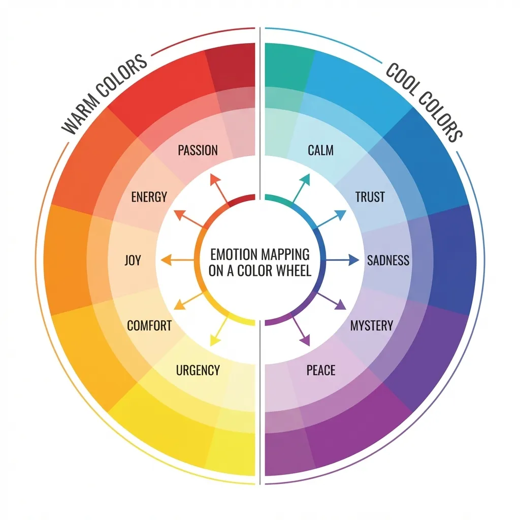
Most color psychology articles read like astrology for designers. They confidently tell you that blue means "trust," red means "danger," and yellow means "happiness." When I built a dashboard for a massive medical logistics startup in 2021, the CEO insisted on using a deep crimson primary color because he read a generic article saying red means "speed and action." I had to spend an entire week fighting him to change it before we shipped to production.
Red doesn't mean speed in a medical context. It means blood, severe errors, and emergency alerts. If you blindly follow color psychology cheatsheets without deeply considering the context of your specific user base, you will fundamentally ruin your interface and tank your usability metrics.
The absolute truth about color associations
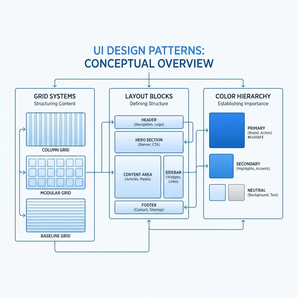
The dumb solution that works is ignoring the emotional buzzwords entirely and focusing strictly on established UI patterns. Users are deeply conditioned by the thousands of websites and applications they use every single day. Green means "go" or "success." Red means "stop" or "destructive action." Blue means "this text is an interactive link."
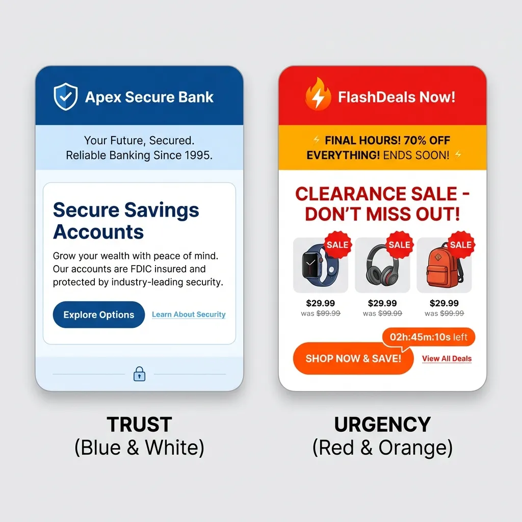
If you build a banking app and make the "Submit Transfer" button red simply because your corporate brand is red, users will hesitate. They will subconsciously assume they are deleting a bank account, not sending money. I've literally watched users physically pull their mouse back during usability testing when confronted with a red confirmation button in a non-destructive context. You are fighting decades of ingrained muscle memory, not human psychology. You cannot win that fight with a brand guide.
Cultural context breaks everything
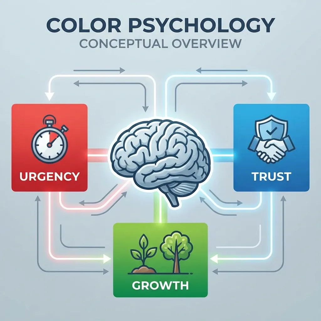
Color associations are entirely localized, which makes global color psychology a complete myth. In Western cultures, white is strongly associated with purity, cleanliness, and weddings. In many Eastern cultures, white is the traditional color of mourning and death. Red means danger and alerts in the United States, but it signifies luck, prosperity, and financial success in China.
There's no clean solution to globalizing color psychology; the expensive workaround is to stick to completely neutral brand colors (like muted blues or grays) for international applications unless you have a dedicated localization team ready to swap out your CSS variables based on the user's geographic region. You simply cannot control cultural associations globally, so play it safe and rely on typography instead of color to convey emotion.
When psychology actually matters in UI
The one place where color psychology definitively impacts business metrics is contrast and legibility, which directly dictates user fatigue. If you use a high-saturation yellow background, it physically strains the user's eyes. They will leave your site because looking at the screen physically hurts, not because the yellow makes them feel subconsciously "anxious."
I think the most successful software brands ignore color psychology completely and just focus ruthlessly on contrast math and consistency. Stripe uses a custom blurple. Vercel is stark black and white. GitHub is completely monochromatic gray. They don't worry about whether their purple makes you feel "royal" or "innovative." They just make sure their text has a strict 4.5:1 contrast ratio against the background according to WCAG 2.1 standards.
(I actually strongly suspect half the reason massive tech companies default to blue is just because it is mathematically the easiest color to pass accessibility checks with while using white text.)
The final takeaway on emotional design
If you want your website to evoke trust, don't paint it blue. Make it load in under 500 milliseconds. Make the navigation predictable. Ensure there are no broken links. Color is a tool for wayfinding and information hierarchy, not emotional manipulation. Stop reading articles about what yellow means, and start testing your interface with actual human beings.