A furious client once printed a screenshot of my website on their cheap office laser printer and called me in a panic. They complained loudly that the vibrant, electric blue button I designed looked like "muddy, washed-out purple" on their paper. They demanded to know why my code was broken.
I had to spend twenty minutes on the phone explaining the fundamental physics of emitted light versus the physics of absorbing ink. If you mix up RGB and CMYK in a professional setting, you will ruin expensive print jobs and you will ruin web graphics. It is an incredibly expensive mistake that happens constantly.
RGB is strictly for screens
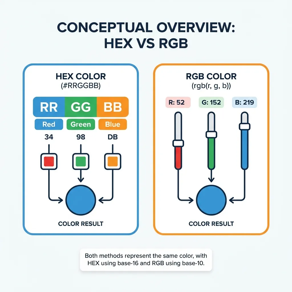
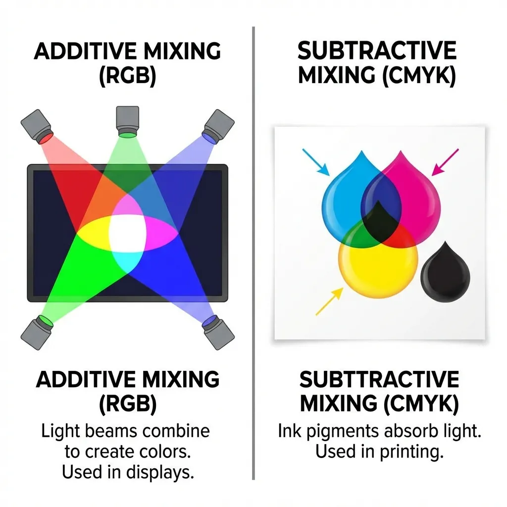
RGB stands for Red, Green, and Blue. It is an additive color model. Your computer monitor, your phone, and your television are essentially grids made up of millions of tiny flashlights. If you turn all the flashlights off, you get pitch black. If you turn the red, green, and blue flashlights on at full maximum power (rgb(255, 255, 255)), the light visually combines to create pure white.
Because digital screens emit light directly into your eyeballs, the RGB model can produce incredibly vibrant, glowing colors that physically exist as light waves—things like neon green, electric magenta, and hyper-saturated cyan. The web operates entirely and exclusively in RGB. If you are designing for a website, a mobile app, a video game, or a digital billboard, you must use RGB. Full stop.
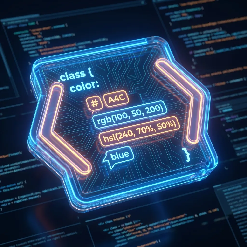
In CSS, you access this space using Hex codes (#FF0000) or the RGB function (rgb(255, 0, 0)). They are mathematically identical instructions telling the browser how much light to push through the pixels.
CMYK is strictly for paper
CMYK stands for Cyan, Magenta, Yellow, and Key (which stands for Black). It is a subtractive color model. A piece of paper doesn't emit any light; it simply reflects the ambient light already present in the room.
When you print something, the physical ink absorbs (subtracts) certain wavelengths of light and reflects others back to your eye. If you mix cyan, magenta, and yellow ink together on paper, they absorb almost all the light, resulting in a dark, muddy brown. That is exactly why commercial printers include a dedicated black ink cartridge (the Key) to produce true, sharp blacks.
(I actually learned this the hard way early in my career when I designed a massive run of business cards in RGB mode. The printer charged me a $50 conversion fee just to fix my files before they hit the press.)
The terrifying conversion nightmare
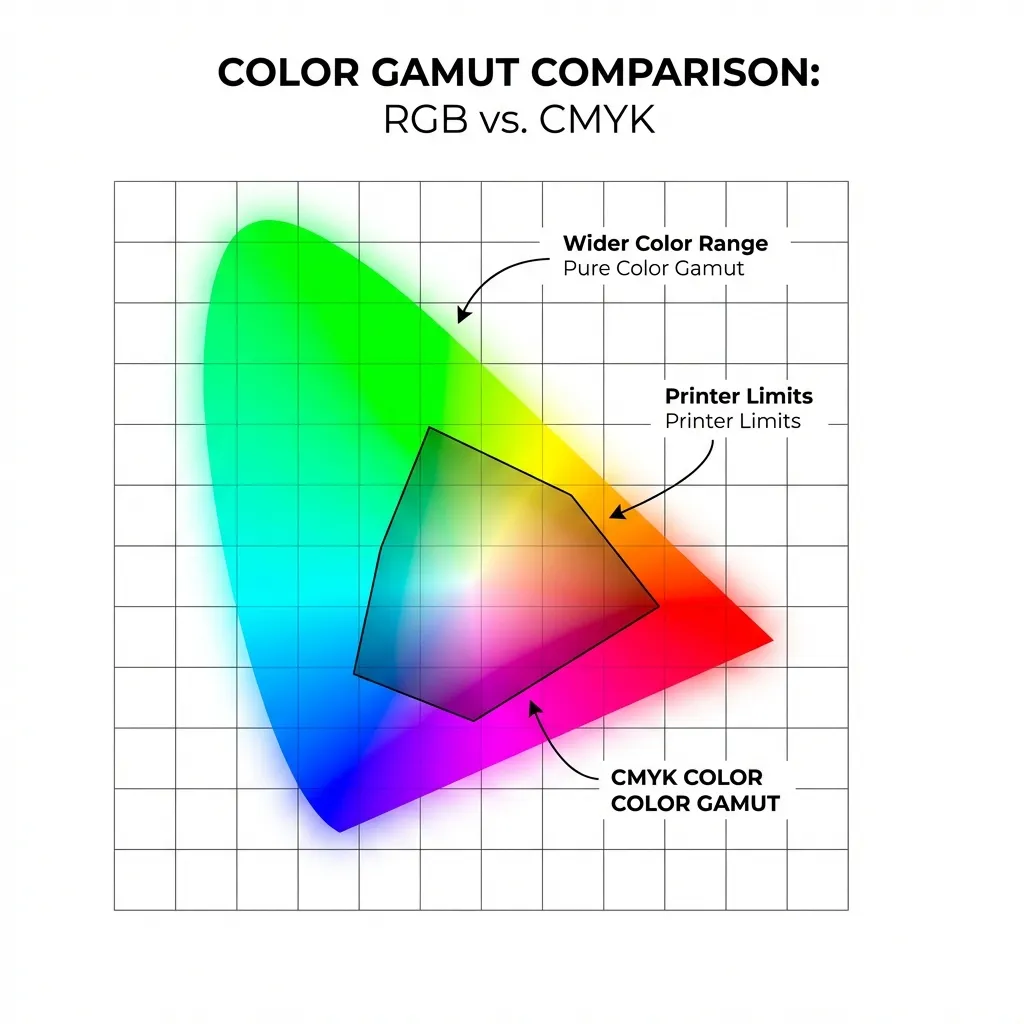
Here is the part nobody mentions in design school: the RGB color space is mathematically much, much larger than the CMYK color space. You can easily create glowing colors on a digital screen that physically cannot be reproduced with standard ink on paper.
If you design a client's logo in a bright, glowing RGB green (like #00FF00) and then try to print it on a brochure, the CMYK conversion algorithm will ruthlessly crush it into a dull, flat forest green. The ink simply cannot glow. There's no clean solution for this limitation in standard printing; the expensive workaround is to use Pantone spot colors, which require custom-mixed fluorescent inks and cost an absolute fortune to run on a press.
I think the automated CMYK conversion algorithms built into tools like Adobe Illustrator are still a mess. They do their absolute best to find the closest printable match, but it is always a massive compromise. You simply cannot perfectly map a glowing pixel to a flat sheet of paper.
The golden rule of workflow
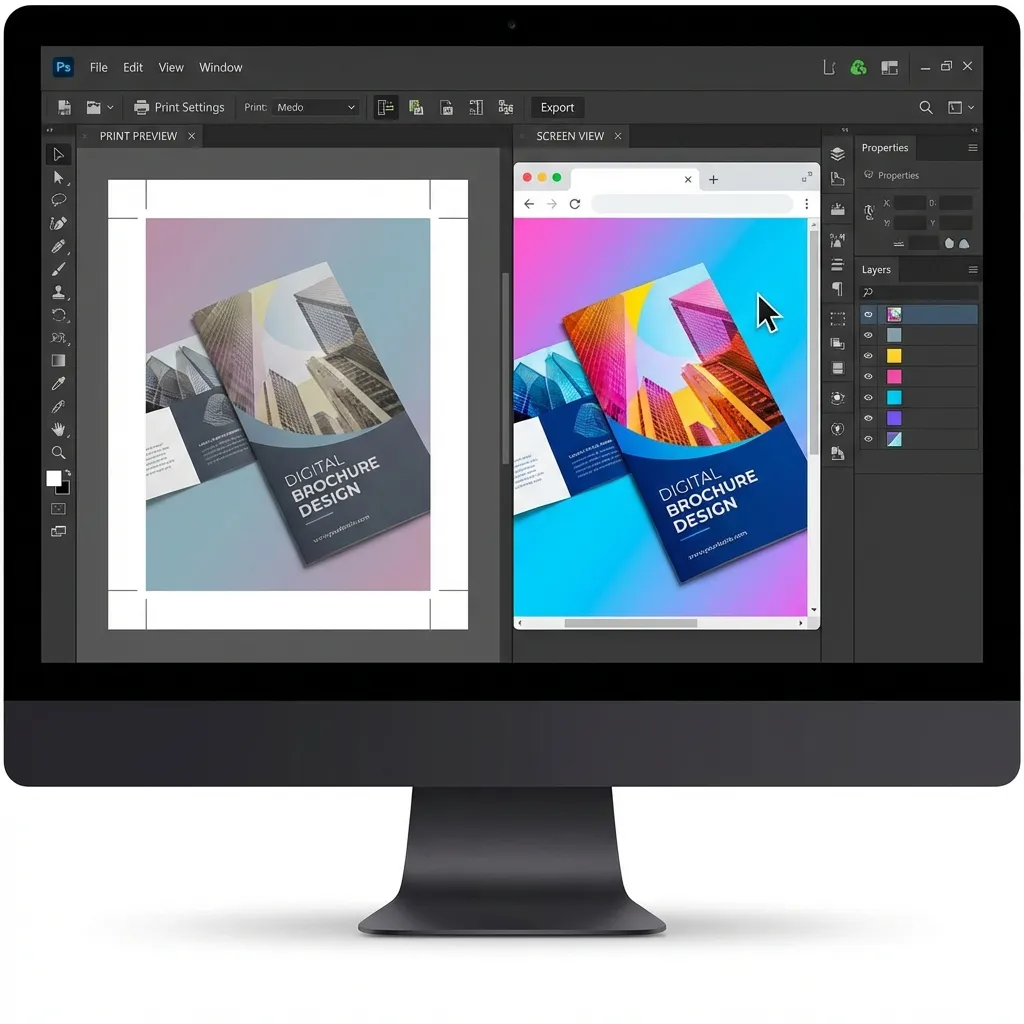
The golden rule is strictly enforcing your workflow order. If the final product will ever touch physical paper, you must design for print in CMYK from day one. Do not design the entire project in RGB and lazily convert it at the end. You will be horrified by the muted results.
For web development projects, stick strictly to RGB. Keep your digital assets and your physical assets in completely separate files. If a client asks why the hex code on their website doesn't perfectly match the ink on their letterhead, explain the physics of light. You will save yourself a very awkward phone call with an angry printer.