I used a brutalist, ultra-high-contrast neon palette for a client project last year. They hated it with a passion. They told me it looked like a broken terminal screen from the 1990s. I thought it was avant-garde and pushing the boundaries of web design. They thought it was unreadable and actively hostile to their users.
Predicting color trends is always risky, but analyzing what is actually shipping in production environments is just basic data collection. We have moved past the sterile, flat-design era of the 2010s. Here are the three distinct palette structures that are completely dominating high-end web development in 2026.
The massive return of warm earth tones
For the last five years, SaaS products and corporate dashboards have been drowning in sterile "tech blue" and highly mathematical, clinical grays. We are finally seeing a massive swing back toward warmth and tactile interfaces.
Designers are systematically replacing stark white backgrounds with warm, paper-like off-whites such as #FAFAF9. They are completely abandoning pure black text in favor of deep espresso browns like #292524. Instead of the aggressive neon blue primary buttons that dominated 2021, we are seeing terracotta, sage green, and muted ochre taking over primary action states.
I think this shift is a direct, psychological reaction to the clinical era of design. Earth tones feel human, grounded, and physical. (I actually rebuilt my entire personal portfolio using a sage green and cream palette just to escape the endless sea of corporate blue I stare at all day.) If you are building a consumer-facing product today, warmth converts better than sterility.
Strict monochrome minimalism
The dumb solution that works exceptionally well right now is the strict monochrome palette. You pick exactly one hue—usually a stark black or a very deep, authoritative primary color—and you use varying mathematical opacities of that single color for absolutely everything else on the page.
This approach forces the designer to rely entirely on typography scale, layout, and white space rather than color to create information hierarchy. It is incredibly hard to pull off well, because if your spacing is off by even a few pixels, the whole page collapses into an unreadable wall of text. But when it works, it looks incredibly premium. Apple has been slowly pushing this aesthetic in their software updates since 2024, stripping out unnecessary color accents in favor of monochromatic depth.
If you attempt this, you must rely heavily on CSS variables. You define a base color like --mono: 10, 10, 10; and then map out your entire interface using RGBA transparency: rgba(var(--mono), 0.05) for backgrounds, rgba(var(--mono), 0.6) for secondary text, and so on. It guarantees perfect cohesion.
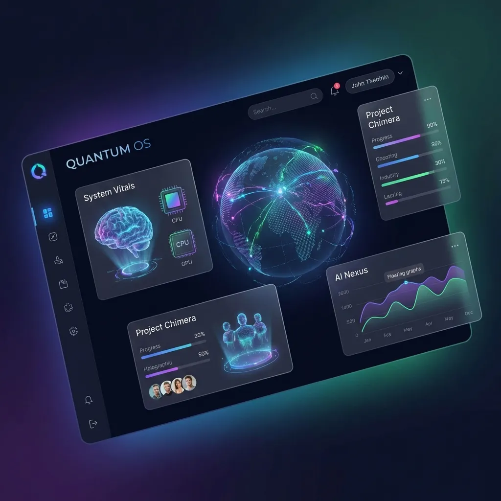
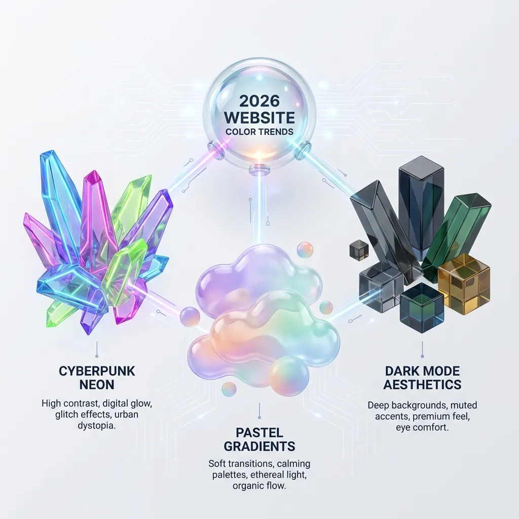
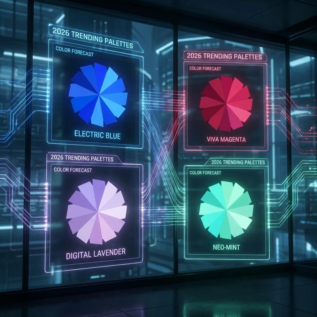
Neon dark mode maximalism
On the complete opposite end of the spectrum is the glowing, high-saturation dark mode UI. We are seeing deep obsidian backgrounds paired with vivid, glowing, hyper-saturated accents in magenta, cyan, and toxic green.
This aggressive aesthetic currently dominates developer tools, cryptocurrency platforms, and AI software products. The trick to making it actually work without permanently blinding the user is extreme, disciplined restraint. The background must be completely devoid of color (#0A0A0A or pure `#000000`), and the neon accent should cover no more than 2% of the screen's total real estate.
There is a massive catch, though. High-saturation trends fade incredibly fast, so I can't honestly say if this neon dark mode approach will still look professional in 2028. There's no clean solution for "future-proofing" a trendy, aggressive palette; the workaround is to ensure your design tokens are abstracted deeply enough that you can swap the core colors out in a single root CSS file when the trend inevitably dies.
Matching the utility to the vibe
You cannot just pick a trend because it looks cool on Dribbble. You have to match the palette to your product's utility.
A retail banking app shouldn't use glowing neon magenta, because users associate neon with gaming and risk, not financial stability. A summer music festival shouldn't use sterile corporate blue and gray, because it kills the energy. You must pick the palette structure that matches the psychological expectations of your users, meticulously test the contrast ratios against WCAG guidelines, and then ship it. Stop worrying about whether a color is "trendy" and start worrying about whether it actually serves the user's immediate needs.